

 How to setup
 Design tokens
Components
 Text
Text  Text field
 Button
 Control
 List cells
 Section heading
 Navigation bar
 Tab bar
 Header
 Toast
Toast Tooltip
 Page
Page Label
Label Cloud box
 Loader
 Slot
Slot Empty state
Modules
 Banner
 Bottom sheet
 Modal
Modal Drawer
 Alert view
 List view
 Collection
 Scalable collection
 Scrollable collection
 Interface editorial policy
 Icons
Icons Skeleton
 Team
Team Changelog
List cells

List cell is a basic component of navigation, action selection, or information block. You can configure the component internally, assembling what you need from it.
List cells support design tokens and any color tokens. Editing is enabled.
Behaviour

Has a configuration type with one button or two buttons. Component size depends on the layout. The button is the same as Button low.
/w=3840,quality=90,fit=scale-down)
Content right always has a 16 px margin from icon and is fixed.

List cells can contain several lines of text on the left.
It can contain any color style but the styles should be limited by tokens. A basic set of tokens:
Colors: Background/Secondary Text/Title Text/Body Icon/Chevron Icon/Notification Divider/Main Control/Tertiary
Typography: Body/Regular Body/Semibold Caption 1/Regular Caption 3/Semibold

List cell supports RTL (right-to-left). Although there’s no automatic RTL option in design (designer should create it manually), there’s such a funchion in code (developer can mirror existing components).
/w=3840,quality=90,fit=scale-down)
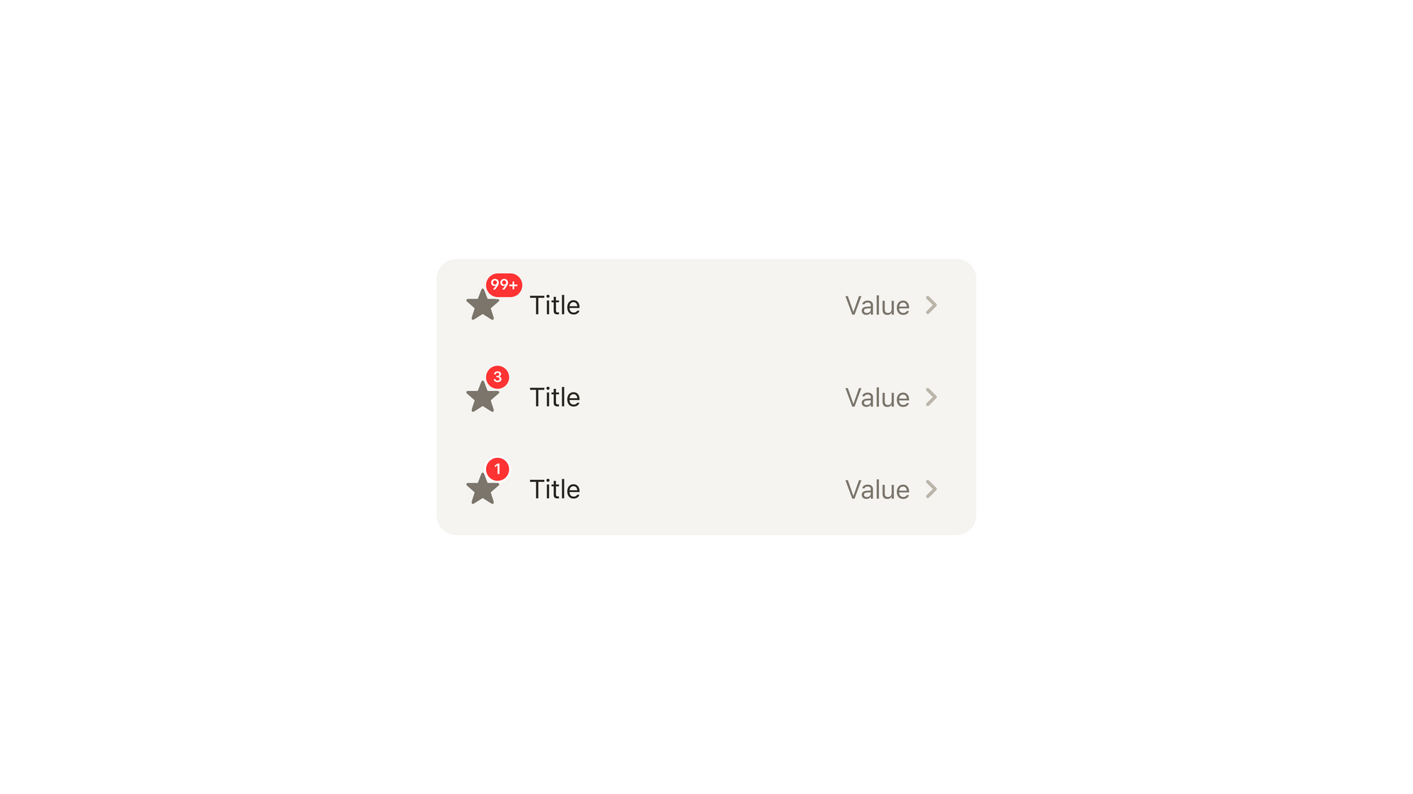
The component supports counter in Content right in all the types. Color outline: Background/Secondary.
Also, List cells support label. It is important to localize this component.
Important: The counter can be with or without value.
List cells support counter in Content Left in Icon types. Color outline: Background/Secondary.
Important: The counter can be with or without value.
Content left
Specs
For one line, there are 18 px top margins. For two lines, there are 8 px top margins.
Recommended length:
Title: up to 80 characters, including space. Subtitle: up to 150 characters, including space.
Default
/w=3840,quality=90,fit=scale-down)
Double text

Inverted text

Icon and text
Icon options:
- Size 40×40: PNG, SVG. The icon comes from Modulor and may have a dark or light theme option.
- Size 24×24: PNG, SVG. The icon comes from Modulor and may have a dark or light theme option.
The 24×24 icon is situated inside the 40×40 block. The 40×40 block may also have a color that comes from tokens.
Icon and double text
Icon and inverted text
List cells with radio button
The component has a Radio button in a 40x40 px block. The indent between radio button and text is 8 px. The padding is 8 px.
Default

Double text

Inverted text

Image and text

The image has 2 sizes: L and XL.
L — 56x56 px
- without indents:
Only container with an image inside.
Padding: 0 Height: 56 px Width: 56 px
- with indents:
Top and bottom padding: 8 px Left padding: 12 px Height: 56 px Width: 56 px
XL — 84x84 px
- without indents:
Only container with an image inside.
Padding: 0 Height: 84 px Width: 84 px
- with indents:
Top and bottom padding: 8 px Left padding: 12 px Height: 72 px Width: 72 px

Without paddings, an image can fill the list cell completely.
Image and double text

Image and inverted text

Content right
Specs
Default
/w=3840,quality=90,fit=scale-down)
The component contains icons + text (value). It can also contain a counter and label.
If the text has more than 15 characters, the end is hidden with "..."
Recommended length:
Max: 13 characters Optimal: 7 characters
Empty

Single arrow
Checkbox

Has the same features as Checkbox.
Checkbox and text

Has the same features as Checkbox.
Radio button

Has the same features as Radio button.
Radio button and text

Has the same features as Radio button.
Switch

Has the same features as Switch.
Switch and text

Has the same features as Switch.
Double text
/w=3840,quality=90,fit=scale-down)
Besides the icon ic/24/chevron_right, the component can also contain other icons.
Double inverted text
/w=3840,quality=90,fit=scale-down)
Icon and text
/w=3840,quality=90,fit=scale-down)
Has the same behavior as Default.
Text
/w=3840,quality=90,fit=scale-down)
Button

The component has the same features as Button low. There is a right margin of 16 px for button.
Image

The image has 2 sizes: L and XL.
L — 56x56 px
- without indents:
Only container with an image inside.
Padding: 0 Height: 56 px Width: 56 px
- with indents:
Top and bottom padding: 8 px Left padding: 16 px Height: 56 px Width: 56 px
XL — 84x84 px
- without indents:
Only container with an image inside.
Padding: 0 Height: 84 px Width: 84 px
- with indents:
Top and bottom padding: 8 px Left padding: 16 px Height: 68 px Width: 68 px

Without paddings, an image can fill the list cell completely.
Slots support

You can use the slots in the components at the bottom. You can set any height of these slots. The width is always 100%.
On this page